Difference Between Serif and Sans-serif Fonts CSS Font Families
CSS Font Families
In CSS, there are two types of font family names:- generic family - a group of font families with a similar look (like "Serif" or "Monospace")
- font family - a specific font family (like "Times New Roman" or "Arial")
| Generic family | Font family | Description |
|---|---|---|
| Serif | Times New Roman Georgia |
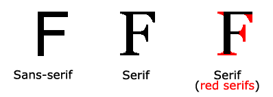
Serif fonts have small lines at the ends on some characters |
| Sans-serif | Arial Verdana |
"Sans" means without - these fonts do not have the lines at the ends of characters |
| Monospace | Courier New Lucida Console |
All monospace characters have the same width |
Font Family
The font family of a text is set with thefont-family property.The
font-family property should hold several font names as a "fallback" system.
If the browser does not support the first font, it tries the next font, and so
on.Start with the font you want, and end with a generic family, to let the browser pick a similar font in the generic family, if no other fonts are available.
Example: Try it yourself
Font Style
Thefont-style property is mostly used to specify italic text.This property has three values:
- normal - The text is shown normally
- italic - The text is shown in italics
- oblique - The text is "leaning" (oblique is very similar to italic, but less supported)
Website Layout
A website is often divided into headers, menus, content and a footer:
1. Header
A header is usually located at the top of the website (or right below
a top navigation menu). It often contains a logo or the website name:Example: try it out
2. Navigation Bar
A navigation bar contains a list of links to help visitors navigating through your website:
Example: Try it out
3. Content
The layout in this section, often depends on the target users. The most common layout is one (or combining them) of the following:
- 1-column (often used for mobile browsers)
- 2-column (often used for tablets and laptops)
- 3-column layout (only used for desktops)
4. Unequal Columns
The main content is the biggest and the most important part of your site.
It is common with unequal column widths, so that most of the space is reserved for the main content. The side content (if any) is often used as an alternative navigation or to specify information relevant to the main content. Change the widths as you like, only remember that it should add up to 100% in total:
Example: Try it out
5. Footer
The footer is placed at the bottom of your page. It often contains information like copyright and contact info:
Example: Try it out
6. Responsive Website Layout
By using some of the CSS code above, we have created a responsive website layout, which varies between two columns and full-width columns depending on screen width:


No comments:
Post a Comment